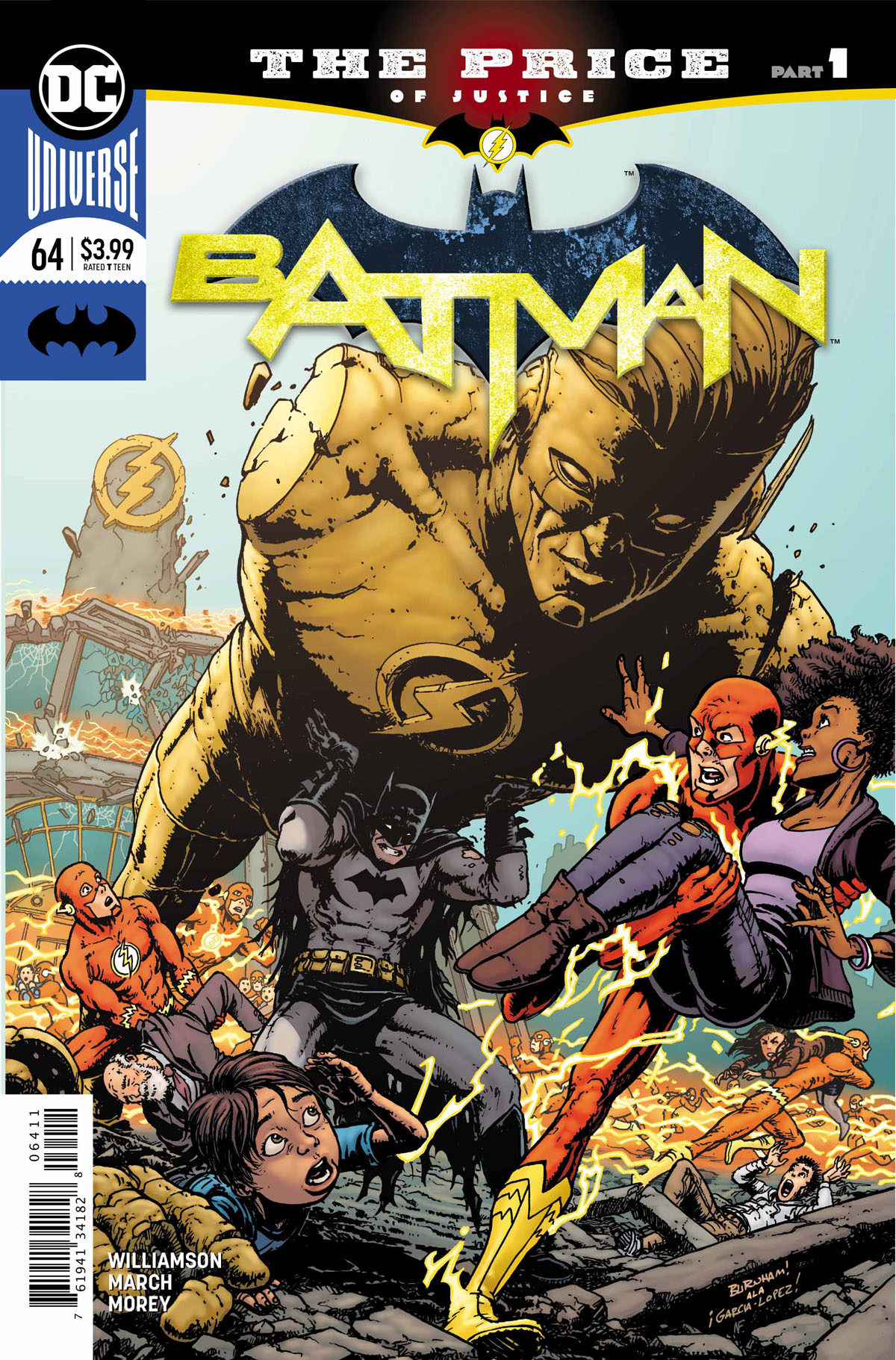
 Batman #64
DC Comics
Written by Joshua Williamson
Art by Guillem March
Colors by Tomeu Morey
Letters by Steve Wands
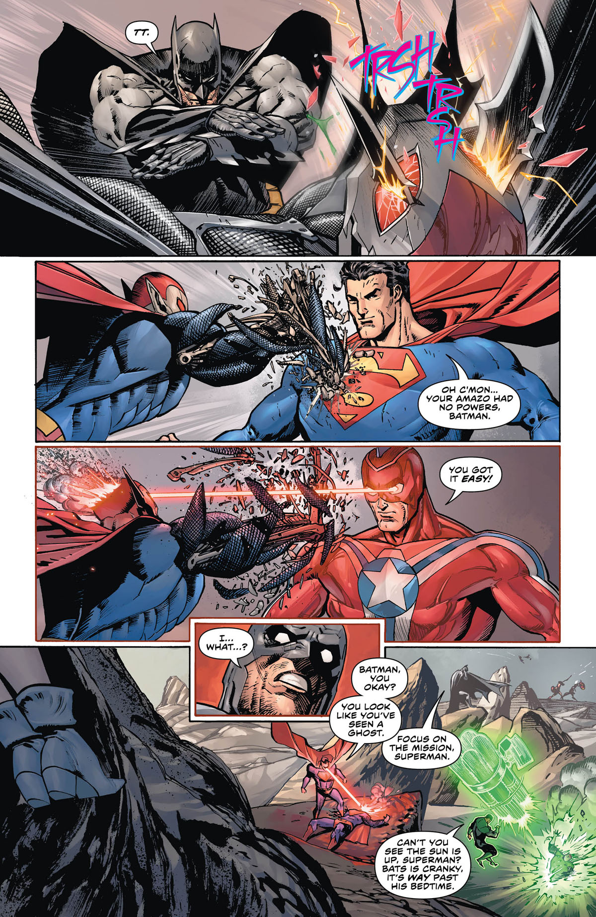
The Justice League are fighting the Amazo version of themselves. As the fight rages on, Batman begins to have hallucinations about victims of the massacre at Sanctuary and when the latest in a long line of battles finally ends, the Dark Knight leaves the scene for parts unknown.

At the same time, Barry isn’t feeling his usual self and everyone knows is has to do with the loss of Wally at Sanctuary. When he speeds off back home, he finds himself speeding towards another problem.
Someone has attacked the Flash Museum and the attack brings in both Batman and the Flash to rescue civilians and fix the damage. In the aftermath, they confront the lies that have building up as well as the shared history they have with Wally. As things get darker and more fraught between them, Batman reveals who is behind the attack. Someone with a connection to the Dark Knight himself.
This issue takes a break from the darkness of the current ‘Knightmares’ storyline by Tom King and hands the reins over to Flash writer Joshua Williamson. It’s appropriate that Williamson takes this part of the story because it falls squarely in both character’s arcs.
Focusing on the incident at Sanctuary was a good story choice. It added weight to the dynamic between Batman and Flash. It also helped to showcase the history between the two characters and the interlude in the Batcave was a great, organic moment that adds to the drama as well as the relationship between Barry and Bruce. Taking the antagonist of this story from Bruce’s recent history adds an additional layer of drama as well as immediacy considering her condition. It will be interesting to see how Williamson incorporates Barry into this story and what its implications are in relation to Sanctuary.
The dialogue is good and the tone is appropriately dark for both characters. Batman does feel like he’s taking a step back in his own book with more emphasis placed on Barry. Hopefully, there is a balance that is created as this crossover continues.
Guillem March’s art is great. I enjoyed the details and the beauty of the splash pages. Other than a few too many open mouth screams, everything was visually solid.


